Clarity in a technical environment.
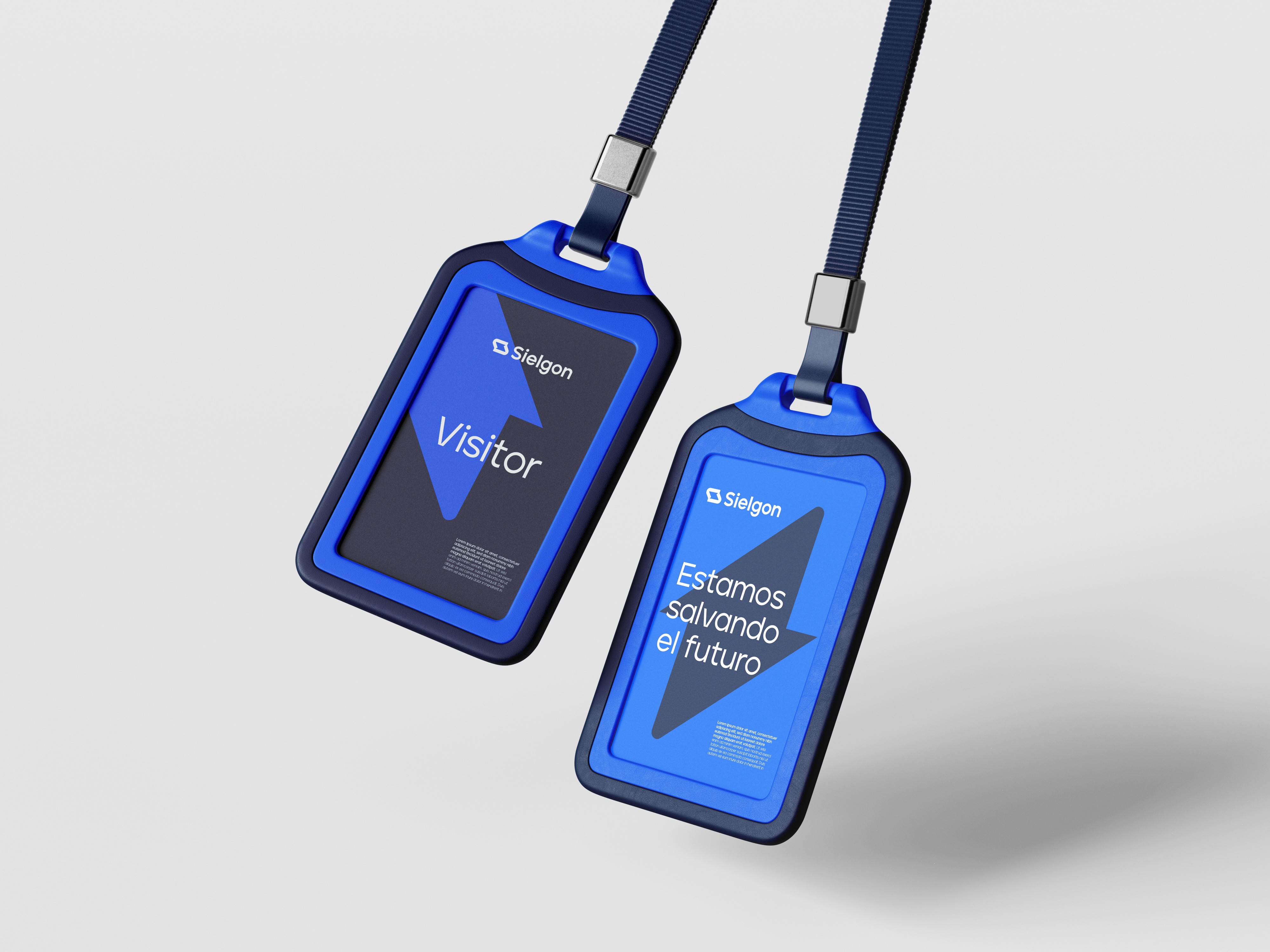
Sielgon operates in a context where complexity is inherent, but communication cannot afford to be.
The project focused on translating technical value into a clear and structured brand language, avoiding unnecessary noise.
The identity system is built around precision and order, reinforcing trust while making information more accessible.
A brand designed to simplify without oversimplifying.
Category:
Branding
Client:
Voltaic
Duration:
2 Weeks
Location:
Girona, Spain